ShopDreamUp AI ArtDreamUp
Deviation Actions


Description
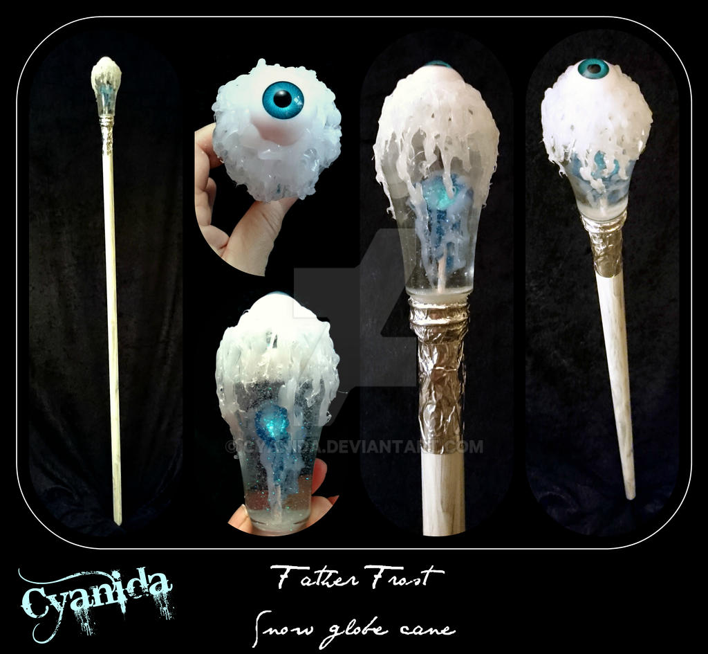
Scratch build, glass flask, curtain rod, fake eye, fake gem, hot glue, aluminium tape and glitter!  (Smile)") Accessory for the Father Frost outfit I'm making for dear husband
Accessory for the Father Frost outfit I'm making for dear husband
Check out this little video clip to see how the "snow" falls www.youtube.com/watch?v=dT_No4…
Check out this little video clip to see how the "snow" falls
Image size
3213x2964px 2.37 MB
© 2017 - 2024 Cyanida
Comments20
Join the community to add your comment. Already a deviant? Log In
Hello! I am here from  and Comment Month. I really must apologize for my lateness!
First thins first: I love the theme and the overall project! Curtain rods have always struck me as perfect walking sticks. It's nice to see someone who finally acted on that instinct and made it look amazing! You're an inspiration! I am a sucker for winter themes, and you've done a great job with this stick - the frost and icicles look like this walking stick really help to push the theme along. And the little details in the centre pummel are a very nice touch. The gem in the middle looks like the heart of winter itself! And finally, the colour scheme just works beautifully. You can't beat the white-on-white-on blue combination! So overall, this was a great piece. You should really be proud of yourself!
I racked my head hard to come up with ways to make this one even better. And I have settled on one thing. I am not sure how the eyeball on the very top fit into the rest of the theme. It's a bit on the gruesome side and just doesn't fir the rest of the refined dandy look that this stick is trying to convey. I think eyeballs can be useful in many occasions, but in this case, it's just too much. I really like the photo part of the collage, but the words down the bottom may also need to be looked into. The font is a handwritten styled font but it's hard to read because the middle section is rather small, making the words look scrawled. And since your logo is large and prominent in this image, it's easy to just read your logo and not notice the scrawled information down the bottom. There are hand-written fonts that may be easier to find. I personally love this website: www.dafont.com/ in terms of looking for new fonts.
Overall, I think this was one heck of a prop and it turned out beautifully. I hope your husband was the perfect dandy when he was walking around with it! Keep up the good work!
and Comment Month. I really must apologize for my lateness! First thins first: I love the theme and the overall project! Curtain rods have always struck me as perfect walking sticks. It's nice to see someone who finally acted on that instinct and made it look amazing! You're an inspiration!
I racked my head hard to come up with ways to make this one even better. And I have settled on one thing. I am not sure how the eyeball on the very top fit into the rest of the theme. It's a bit on the gruesome side and just doesn't fir the rest of the refined dandy look that this stick is trying to convey. I think eyeballs can be useful in many occasions, but in this case, it's just too much. I really like the photo part of the collage, but the words down the bottom may also need to be looked into. The font is a handwritten styled font but it's hard to read because the middle section is rather small, making the words look scrawled. And since your logo is large and prominent in this image, it's easy to just read your logo and not notice the scrawled information down the bottom. There are hand-written fonts that may be easier to find. I personally love this website: www.dafont.com/ in terms of looking for new fonts.
Overall, I think this was one heck of a prop and it turned out beautifully. I hope your husband was the perfect dandy when he was walking around with it! Keep up the good work!